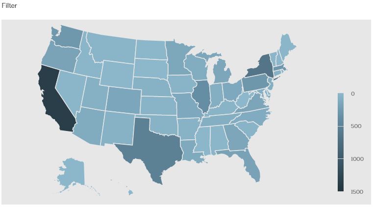
Equity by Design is pleased to introduce EQxD Interactives, which have been designed to compliment our Metrics blog series by allowing readers to take a deeper, and more personalized dive into data from the 2016 Equity in Architecture Survey. Following each month’s Metrics post, we’ll provide an interactive module that allows all of you to explore the story more deeply by zooming in on responses from particular demographic groups or geographic regions, or by gaining a better understanding of the ways in which responses to a group of questions relate to one another. Please keep reading below to learn more about EQxD Interactives, and our first interactive module, Demographics. We hope you’ll try it out!
When we share findings from the Equity in Architecture Survey, one of the questions that we receive most often is “All of this is really interesting, but how does the data relate to ME?” This question takes many forms, with some individuals interested in how their state responded to a question, and others interested in zeroing in based on factors like firm size, race or ethnicity, or experience level. All of these questions tell us that many people are engaging with the data on Equity in Architecture, and want to take a more hands-on approach to make our findings more personal. These interactives have been created by Paul Ko, Head of LinkedIn Economic Graph Analytics, and build upon the static infographics designed by Atelier Cho Thompson. We are so grateful for all of their contributions.
How EQxD Interactives Work
Our interactive graphics are intended as a supplement to, rather than a replacement of, the analyses shared in our static infographics, written analyses, and data presentations. Whenever we look at a subset of our data, it reduces the sample size under consideration. Often, this means that outliers within the sub-sample group that had been insignificant when looking at a larger sample group take on disproportionate weight, and make results less predictable. For instance, a fresh college graduate living in Iowa and making $200,000 a year would only move the national average salary for fresh grads marginally. Meanwhile, if we examined the same data for the much smaller pool of Iowa respondents, that single unusual response might skew the statewide average, making it look like the average salary in Iowa is much higher than it really is. (Note: This is a totally hypothetical scenario. But if you’re making $200,000 working in architecture straight out of college, we want to know about your job!)
We have addressed this issue by programming our interactives so that they don’t return results when the sample group size gets very small. We would also suggest that you think critically about the information contained in the interactives (does this make sense? Is there a lot of “noise” in the data?), and focus on the trends (i.e. those with more experience tend to make more money, or those in one state tend to make less, on average, than those in another state) more than on specific data points (i.e. the average salary for young Iowans is $X).
Demographics Interactive
Our first interactive infographic is designed as a compliment to our recent article on Demographics. The “filter” button at the upper left hand corner of the page allows you to filter results by experience level, firm size, and race or ethnicity. Clicking on a state in the map will take you to a page showing results for that state only.
As we discussed in our article on demographics, the 2016 Equity in Architecture Survey sample is less experienced, and more female, on average, that the profession as a whole. This means that the information shown in these graphics -- and especially the graphics on age, years of experience, and gender distribution -- represent the demographics of our respondents, and don’t necessarily reflect the demographics of the profession at large. This information provides the context in which the results of the Equity in Architecture Survey should be interpreted. Nevertheless, these interactive graphics provide valuable insights by enabling each of you to explore the ways in which gender, race or ethnicity, experience level, firm size, and geographic location interrelate. Moreover, there’s an opportunity to see how all of these factors relate to educational attainment, salary, seniority, and the types of project work that respondents undertake.
We hope that the interactives are a useful tool that helps all of you to explore and contextualize data from the 2016 Equity in Architecture Survey more fully. Please use the comments below to let us know whether you’re finding them useful, and what you hope to see in the future!
